
Top 10 Data Analytics for Fraud Detection – Part 2
Number two, suppliers that are paid too much. Why do we think that this should be number two?
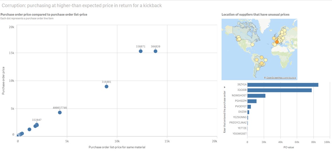
Let’s click on it again, $15,000 in your purchase order price. So it means that you’re paying your supplier much more than you would expect. And if you click on this, you can see straight away who’s the user, where is that supplier.
So they’re in Strasbourg. And we can see what the material number is. We switch to that.
And we can see even who the supplier is. So that’s a really quick one to see if you’re paying your suppliers too much as a typical example of corruption. Then we have another one, which is another way of looking at statistics to do with pricing.
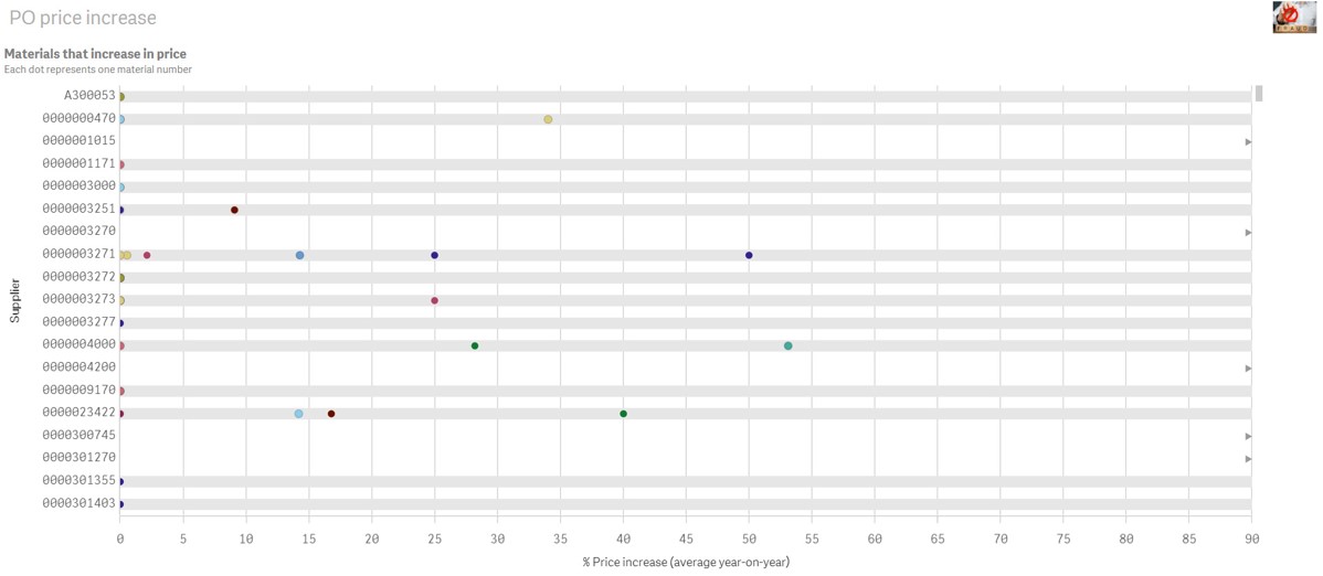
The price increase has gone up by 53% for that same type of consultant, which you might think that’s not normal, right? If you’ve got people in purchasing, their job is to actually negotiate the prices. So why would they have such a huge year on year increase? That’s also an indicator that there might be some corruption going on. So when we say corruption, as I said before, these are indirect indicators because we don’t actually, we can’t see the envelope going under the table.
And we are not looking at emails here because we’re not doing email investigation. But we can look at these indirect indicators that give us an idea of where we might want to look. All right, next one is vendor-employee relationships.
So this is a key one because we want to make sure that our employees are not working with the same vendors for too long. And if they are, they might get too much of a special relationship with them. So we’ve got another one over here where we can start to look at this one, where we actually see if the employee has a special relationship with a vendor.
So if I go into here, and then I’m gonna go to number four. So in here we can see, we get the idea who’s working with who, right? So here you can see that Hamid is the main one who’s working with Tiefland and Alucast. Okay, those are his main ones. But he’s not actually the only one because there’s a little bit of a down swoop there also to Colin. So he’s also working. So these are the purchasers that are working with these suppliers. But what we wanna see is, do we actually have any suppliers that are only working with one particular purchaser? So what I’m gonna do, here I’ve got the number of suppliers and here I’ve got the purchaser. So I’d go over to the right and wait until it gets down to one. And then I’m going to click on somebody, I’m gonna choose somebody interesting.
Here you can see that you got some strange people because you’ve got AP purchaser, you’ve got buyer, begin. These don’t really look like real people, right? Or real suppliers. So if you click on one, then you might be able to see who is actually purchasing. If they’re purchasing from the same supplier over a long period. So for this one, for example, you can see that this particular user, C3380404, is always only working with Sneda. And they’re the only one working with Sneda from 2006 to 2009.
So this is SAP sandbox data, but it’s to give you the idea, like what you are looking for is people that only work with one particular supplier for a really long time. Because that means that they’re getting a special relationship in there. All right, now the next one we’re gonna look at is special customers.
So customers are also really key for corruptions. We need to make sure that we don’t do anything special with the customers, like giving them free goods, too many of them, or really low products and things like that. So what we’re gonna look at here is a waterfall and looking at their net margin.
So if I go into this particular example, and it’s gonna be our number eight, then we’re gonna see how we can really quickly detect when we have negative margin. All right, so going in here and then press play. And then here you can see, so we’ve got our nice waterfall, we’ve got gross margin down to the net margin.
Everything looks fine overall, right? But this is why we want to use data analytics. Actually, if I go to the sheet, it’d be better. This is why I wanna use data analytics, because actually with the scatter diagram right next to it, we can see that we do have some negative margins down here.
And it’s quite exciting, even though overall it looked fine, but when I click on one particular customer, I can see that there are actually negative margins. So this is something really interesting. You wanna be able to quickly see immediately whether or not you’ve got negative margins going on and not just rely on this nice looking waterfall, which gives you a good overall picture.